
I love knitting colorwork. There's something about making little pictures appear that is so addictive - you just want to keep going until the next motif is finished! It's fun to design too - I quite enjoy the challenge of transforming a limited number of squares into something recognizable and beautiful.
But, for the uninitiated, colorwork can be quite intimidating. How do I choose the right colors? Why does it make my gauge all weird and pucker-y?? What do I do with all these ends?!!
Today, I'll be sharing some of my tips and tricks for success with colorwork. This isn't a be-all, end-all guide, but it should help get you started on or improving your colorwork skills.
CHOOSING COLORS
Back in the early days of my knitting journey (my 8th project on Ravelry!), I decided to give colorwork a try. I downloaded a copy of Adrian Bizilia's Squirrel & Oak Mittens and went to my local yarn shop and picked out what I was sure was two sufficiently contrasting yarns, after all, look at how bright that purple was!

I ended up with mittens that looked like this:

If you squint really hard, you might be able to see the squirrel and oak leaf... maybe. So where did I go wrong?
To get science-y about it, every color has a hue, a value, and a saturation.
Hue is what we normally refer to as color: blue, red, green, etc.
Value is the relative lightness or darkness of a color, or, how much white or black is added. Value takes red to a pink (white added) or to a deep crimson (black added).
Saturation tells us how "rich" or intense the color is - e.g. a pale pink versus a hot pink. [For more on the topic, Tin Can Knits has a great overview for knitters]
For a colorwork pattern to "pop" you need it to be high contrast. The tricky part with colorwork knitting is that while the color/hue may be noticeably different (blue versus green, or purple versus gray) if the saturation and value are close, you're going to end up with a low-contrast, muddled mess like my squirrel mittens. But value can be hard to read with the naked eye - so what do you do?
There are a few things you can do (from least to most effort).
1) Snap it!
Most digital cameras and/or phones with a camera will have some kind of readily-available black & white/grayscale filter. Essentially what a black and white filter does is remove the hue - leaving you with the value and saturation.
If you take my mitten example above and turn it into a grayscale image, it becomes immediately clear, even in the skein, that those colors have very similar values and saturations and therefore almost zero contrast.

Here's another example. I threw together a quick colorwheel from yarn I had on hand. All of the hues are clearly different, but when you cut back to value and saturation, the red, purple and blue are almost indistinguishable.

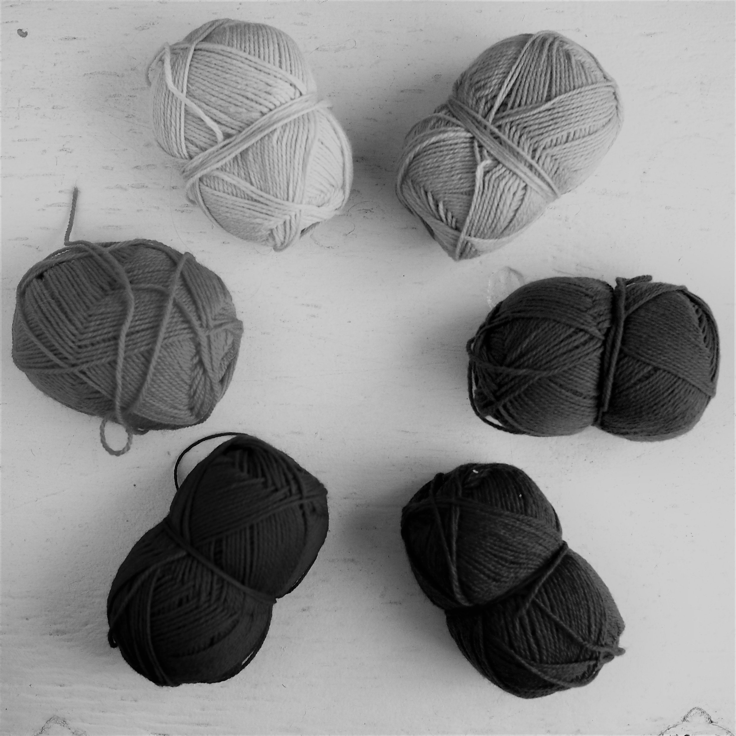

NB: This scale only applies to the yarns above, as the value and saturation of any yarn may vary despite the being similar hues.
In the grayscale version, we can see four distinct values, from the light (yellow) to the light-mid (green), to the dark-mid (orange), to the darks (red, purple, and blue). For a two-color project, the further apart on the scale, the greater the contrast (with black/white being the greatest possible option). For a three-color project, you'd want a light, something with a mid-range value, and a dark. The more colors you add the more complex it becomes.
Don't have a camera on hand? Sometimes squinting can help block out the hue.

2) Wrap it!
Part of the problem of looking at the yarn in the skein is that you're looking at a whole lot of it at once, whereas in colorwork, you're looking at a few stripes or stitches at a time. Pulling out just a few strands and laying them next to each other gives you a more realistic view of the quantity of each color.
If you have access to a colorcard, they've already done the work for you - I've snipped out bits of my colorcards and rearranged and re-taped to the card countless times.
If you don't have access to a colorcard, you can make your own project specific one (assuming you're using yarn you've already purchased) by wrapping yarn around an index yard folded in half.


3) Swatch it!
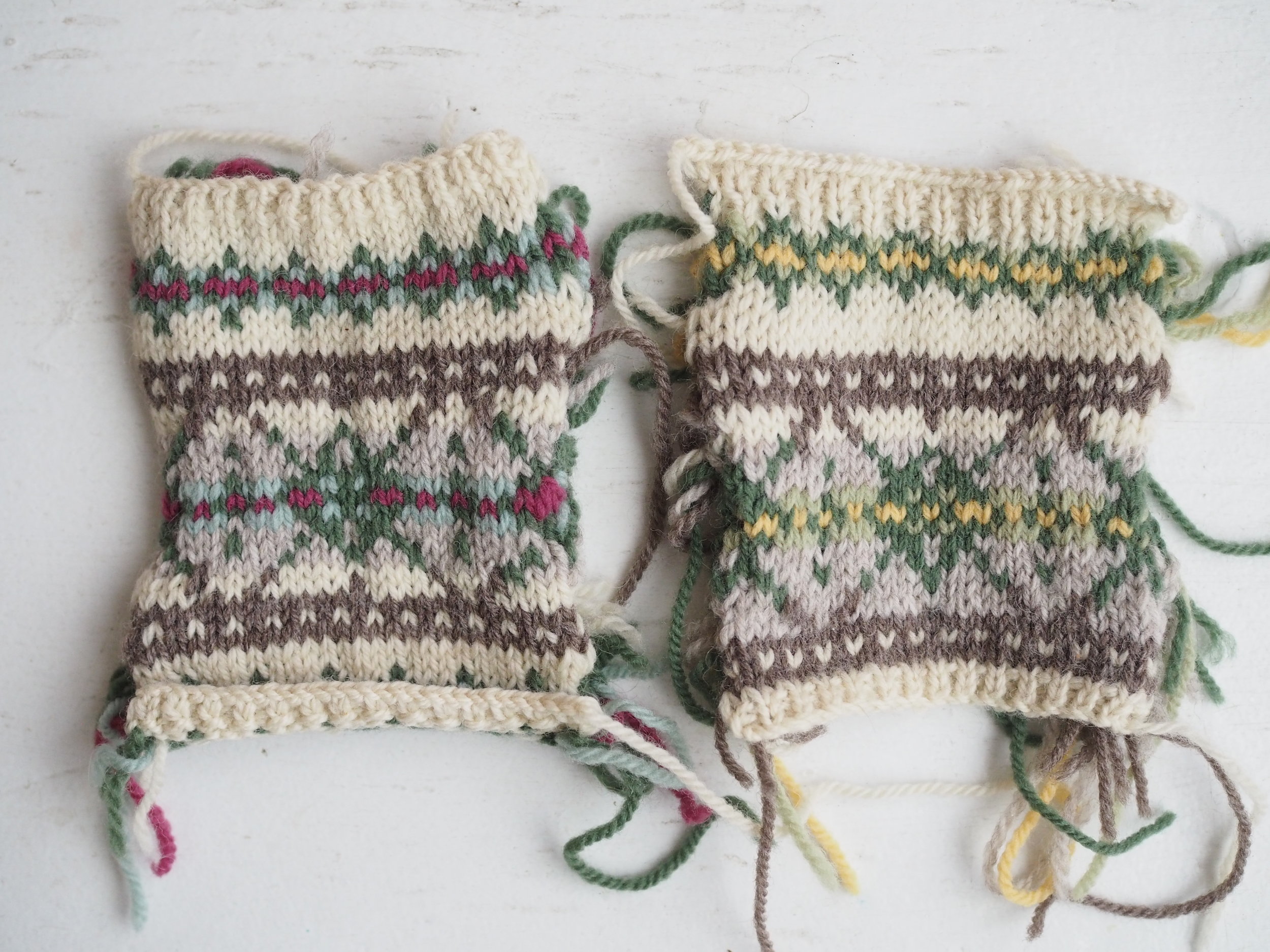
For the most accurate color test, a swatch is the only way to go, particularly for 3+ color designs. For my Cormous Cardigan I did 10+ swatches before settling on my final three colorways below. (Bonus points if you manage to run into Mary Jane Mucklestone and get expert advice in the middle of your swatching process!). For swatching colorwork, I recommend "speed/swift" swatching in the round (See Ysolda's tutorial here.)

Once you've got a colorway that is working, you can use your knowledge of value and saturation to mix it up by swapping out colors with similar values/saturations. In the swatches below, 4 of the 6 colors are exactly the same. The only changes are yellow for magenta and pale green for mint green, but it makes a huge difference in the final swatch. The original one of the left has a cooler, more wintry feel, while the swatch on the right is brighter and more springy.
MANAGING TENSION AND GAUGE
So you've got your colors, but what about the actual knitting part?
Colorwork is almost ALWAYS going to have a tighter gauge than non-colorwork stockinette knitting. And the longer the "floats" between stitches of a certain color, the more true that's going to be.

It's simply the nature of the beast. Regular knit fabric has give and stretch because it is essentially a series of loops. As you pull horizontally, those loops flatten into a straight line. With colorwork, the float (or non-working yarn) is traveling in a straight line between stitches (black, in the example above), so it doesn't have the same slack to stretch with.
To counteract that natural tightness, we need to add more slack to the float so they act more like regular knit stitches. You can do this in a variety of ways (and may need to combine some!):
- Going up a needle size (or more);
- Changing from a slick metal needle to a wood or bamboo one;
- Working on a circular needle with a cord that is the exact size, or slightly larger than your finished circumference;
- Regularly stopping to space out the stitches/floats on your needle; or my personal favorite,
- Knitting "inside out"
Knitting Inside Out
Knitting inside out is way easier than it sounds and is a great way to manage tension on smaller items like mittens, hats, and socks. It makes a bit of a difference with the body of a sweater, but not as much.

Right Side Out

Inside Out
When you knit right side out, the right side of the garment is facing outward and the needles are on the side of the fabric closest to you. When you knit inside out, the wrong side of the garment is facing outward and the needles are on the side of the fabric farthest from you. You're still knitting normally, you're just looking at smaller portion of the right side fabric. The reason this helps is because the outside circumference of the garment (here a sleeve) is slightly bigger than the inside, which is usually mushed up on your needles. To cover that longer distance, your floats have to be just a little bit longer, which makes all the difference.
MANAGING ENDS
If you've only got two colors and they're used consistency throughout the project, ends shouldn't be a huge deal and you can weave them in as you normally would (trying to keep each end to its matching color as much as possible). But if you're doing something with a lot of color changes, you're going to have a lot of ends, which can be a real drag to weave in individually.

So many ends!!!

So much better...
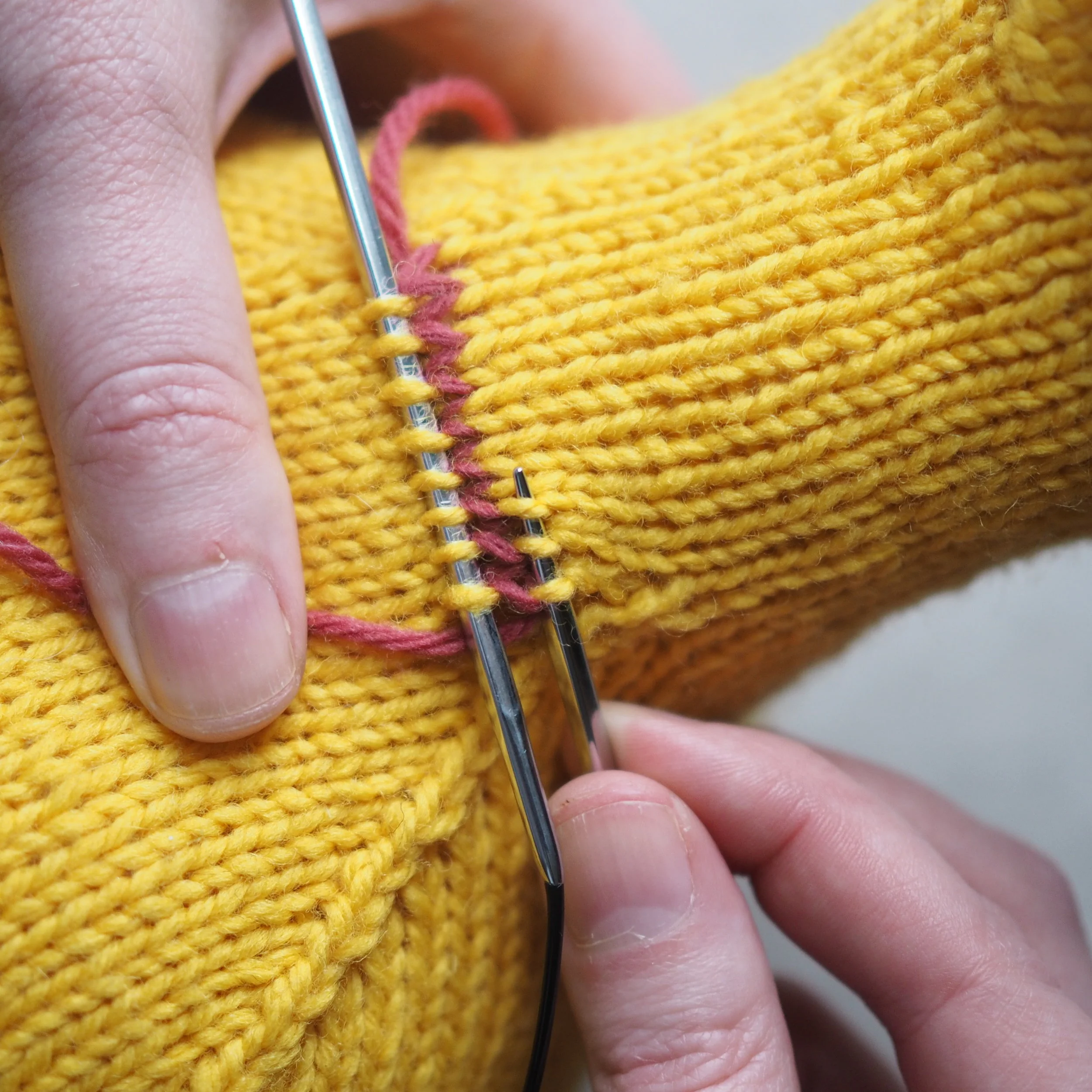
With a copious amount of ends, it's easier (and still secure!) to simply braid them. But first, you need to prep your piece.

First, decide which end you want to start braiding at. It will be less bulky at the start than at the end of the braid. For a sleeve, I recommend starting at the wrist and ending at the armsceye. At a minimum, you'll want to pin down your garment at the top. You may also wish to pin out the sides so your braiding doesn't distort your fabric. Separate the yarn ends at the top of the piece into three roughly even parts and begin braiding, adding new ends to the back of the thirds as you come upon them. [This braiding technique is exactly the same as Dutch/Reverse/Inside Out French Braid if you need further help, and is, incidentally, the only kind of French Braid I know how to do.].

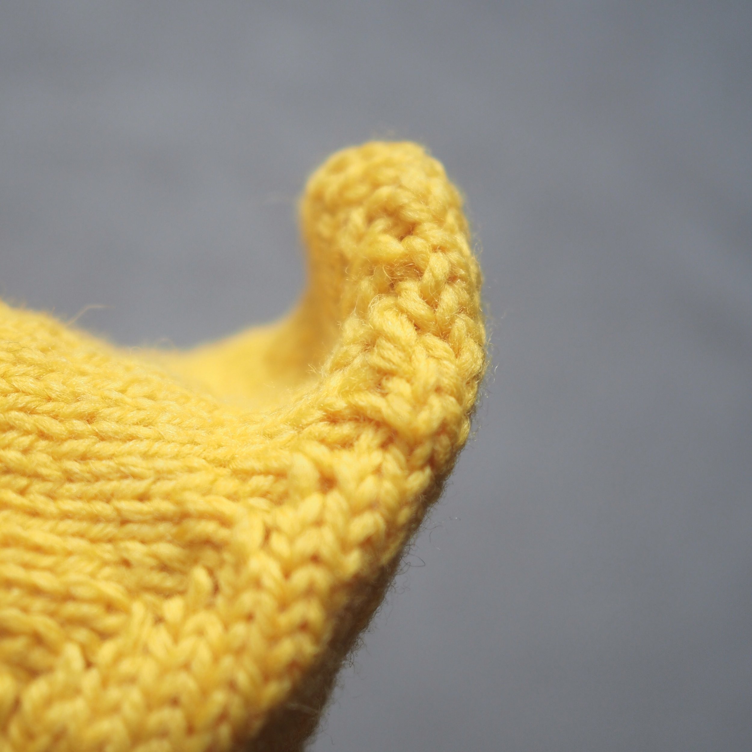
When you get to the end of your garment, keep braiding for at least another inch and tuck the braided "tail" into the braid.

Lastly, give the braid a block with a steamer (or iron and pressing cloth) to flatten. Over time it will start to felt together and become even more secure (assuming you're not using a superwash yarn).
RECAP
- To choose sufficiently contrasting colors, remember that a yarn's value and saturation is more important than hue!
- To check value/saturation:
- Snap it! Take a grayscale photo
- Wrap it! Use color cards or make your own to look at colors more portionally
- Swatch it! Just do it. Really.
- Consider ways to extend your floats and keep your knitting stretchy, including needle changes and working inside out.
- Got a ton of ends? Braid them!!
For additional colorwork tutorials (like steeks), check out some of my favorite resources at Tin Can Knits, Paper Tiger and Kate Davies.
GET KNITTING!
For some beginner-friendly colorwork patterns, check out the following designs, which incorporate short floats and repeats:

Inspired by cross-stitch embroidery and old wallpaper, Madalynn is a subtly-toned infinity scarf which features stripes on one end and a simple colorwork pattern on the other.
The scarf is knitted in the round as a tube in stockinette stitch, first in cross stitch pattern, then stripe pattern. Scarf is then blocked flat before the ends are grafted together.
Instructions are given for working with dpns, and links are provided for working with 2 short circs and magic loop.
- 52" [132 cm] circumference and 4" [10 cm] wide
- 724 yds of Sport weight yarn, sample shown in Quince & Co. Chickadee in Kittywake 151 (MC) and Frost 103 (CC)
- 16-inch circular needle or dpns, US 5 - 3.75 mm
- 36 stitches and 30 rows = 4 inches in cross stitch pattern
Photos © Carrie Bostick Hoge

Contains almost* everything to a matching hat & mitten set.
· Pattern Booklet for sizes child to large adult
· Nature Spun Sport by Brown Sheep Company (100% USA wool) to complete adult-sized hat & mittens - 2 skeins for hat OR mittens, 4 skeins to complete both adult-sized patterns
· Tapestry Needle
*You will need to supply size 4 US(3.5 mm) and 6 US (4 mm) circular needles

Inspired by sweaters of the 1940s and 50s, this seamless raglan pullover features a geometric colorwork pattern reminiscent of acorns and is perfect for your next sock hop or pep rally. Knit from the bottom up without waist shaping.
Sample is knit in size 38 with approx. 1”/2.5 cm negative ease. Intended to be worn with 1-2” / 2.5-5 cm negative ease.
- 30 (32, 34, 36, 38, 40, 42, 44, 46, 48, 50, 52, 54, 56, 58)”/ 76 (81.5, 86.5, 91.5, 96.5, 101.5, 106.5, 112, 117, 122, 127, 132, 137, 142, 147.5) cm at bust.
- 880-1540 yds of Worsted weight yarn, sample shown in Cascade 220 in Chocolate Heather #2431, Smoke Blue #9567, and Straw #4010
- 24 to 36-inch circular needle and set of dpns, US 7 - 4.5 mm and US 5 – 4.5mm
- 24 stitches and 27 rows = 4 inches in stockinette stitch
Learn more about Oakdale in the Chronicles
Photos © Bristol Ivy
Want a little challenge?
These designs keep it to two colors, but have larger motifs/longer floats to manage.
Swedish-inspired lined mittens featuring a braided band and colorful crown motif. Coordinates with the krona tam. See Krona Collection for purchase of both patterns at a discount.
Braided band is worked flat and seamed. Mitten stitches are picked up from the band and worked in the round.
Pattern includes charts for cable and colorwork.
- One Size
- 500-543 yds of Sport weight yarn, sample shown in Quince & Co. Chickadee in Carrie’s Yellow and Delft
- Set of dpns, US 3 - 3.25mm and US 2- 2.75mm
- 30 stitches and 36 rows = 4 inches in stockinette stitch
Learn more about the krona mittens in the Chronicles
Photos © Leah B. Thibault

A two-tone colorwork hat, inspired by the work of 19th century photographer Eadweard J. Muybridge whose work in photographing locomotion laid the groundwork for the first motion pictures. Knit from the bottom up, the hat decreases to a flat top after the colorwork panel is complete and is topped off with an optional braided tassel.
- 17.5, 20.5, 23.5 inch/ 45, 52, 60 cm circumference
- 250-362 yds of Sport weight yarn, sample shown in Quince & Co. Chickadee
- 16-inch circular needle, US 3 - 3.25mm
- 30 stitches and 36 rows in stockinette stitch
Learn more about Zoetrope in the Chronicles
Photos © Leah B. Thibault
Fits head size 20-22 inches.
A Swedish-inspired tam featuring a braided band and colorful crown motif. Coordinates with the krona mittens.
Braided band is worked flat and seamed. Hat stitches are picked up from the band and worked in the row.
Pattern includes charts for cable and colorwork.
- One Size
- 181 yds each color of Sport weight yarn, sample shown in Quince & Co. Chickadee in Carrie’s Yellow and Delft
- 16-inch circular needle, US 3 - 3.25mm and US 2 – 2.75 mm
- 30 stitches and 36 rows = 4 inches in stockinette stitch
Learn more about the krona tam in the Chronicles
Photos © Leah B. Thibault
Ready to tackle something big?
You're still only using two colors at a time, but numerous color changes mean more ends and more color decisions to make (unless you pick the kit option and I'll do the color-choosing work for you!)

Each kit contains:
A printed copy of the Cormous Cardigan pattern
13 (13, 13, 13, 16, 16, 16, 18) skeins of Brown Sheep Yarn Nature Spun Sport (100 % Wool; 184 yd/168m per 50g/1.76 oz. ball) based on the following sizes:
Size
33.75 (36.25, 37.75, 40.75, 44.75, 46.5, 49.25, 52.25)’/85.5, 92, 96, 103.5, 113.5, 118, 125, 132.5 cm bust circumference, including buttonband.
Sample is in size 44.75”/113.5 with approx. 1”/2.5 cm of positive ease
Need a larger size kit than what’s listed in stock? Let me know and I may be able to work something out!
Skeins by Size
C1 – 4 (4, 4, 4, 5, 5, 5, 6) balls
C2 – 3 (3, 3, 3, 4, 4, 4, 4) balls
C3 – 2 (2, 2, 2, 3, 3, 3, 3) balls
C4 –2 balls all sizes
C5 – 1 (1, 1, 1, 1, 1, 1, 2) ball
C6 – 1 ball all sizes
Colorway A - Green/Pink (as sample)
C1 – Pewter Green (401)
C2 – Aran (n91)
C3 – Stone (701)
C4 – Ash (720)
C5 – Artic Moss (n20)
C6 – Bold Sangria (301)*
Colorway B - Green/Yellow
C1 – Pewter Green (401)
C2 – Aran (n91)
C3 – Stone (701)
C4 – Ash (720)
C5 – Bamboo (155)*
C6 – Harvest Wheat (302)
Colorway C - Blue/Salmon
C1 – Cobalt Blue (137)
C2 – Aran (n91)
C3 – Toffee Bar (750)
C4 – Ash (720)
C5 – Winter Blue (117)
C6 – Salmon (145)
For recommended US 3 and US 6 needles, check out the supply shop.
* Some colors are now discontinued - so orders are limited to what I have in stock.

Corms, bulbs, tubers, and rhizomes form the hearts of many of spring’s first-blooming plants, like crocuses, daffodils, peonies and irises (respectively). Or more accurately, corms and their like form the stomach and liver of the plant, processing and storing energy to help them survive harsh winters and other adverse conditions. Like cormous plants that shed their tired leaves and are reborn in the spring, the colorwork pattern of this cardigan was inspired by the removal of layers of old wallpaper being stripped down to make way for a new generation of homeowners.
Size
33.75 (36.25, 37.75, 40.75, 44.75, 46.5, 49.25, 52.25)’/
85.5, 92, 96, 103.5, 113.5, 118, 125, 132.5 cm bust circumference, including buttonband.
Sample is in size 44.75”/113.5 with approx. 1”/2.5 cm of positive ease
Yarn + color(s)
Brown Sheep Yarn Nature Spun Sport (100 % Wool; 184
yd/168m per 50/1.76 skein) in the following:
C1 – Pewter Green (401) – 3 (4, 4, 4, 5, 5, 5, 6) skeins
C2 – Aran (n91)- 3 (3, 3, 3, 4, 4, 4, 4) skeins
C3 – Stone (701) – 2 (2, 2, 2, 3, 3, 3, 3) skeins
C4 – Ash (720) – 1 (2, 2, 2, 2, 2, 2, 2) skeins
C5 – Artic Moss (n20) – 1 (1, 1, 1, 1, 1, 1, 2) skeins
C6 – Bold Sangria (301) – 1 skein all sizes
Gauge
28 sts and 32 rows = 4”/10 cm in colorwork pattern
Adjust needles as needed to match gauges.
Needles & Notions
US 3 [3.25 mm] 32” for body and dpns (or magic loop) for sleeves
US 6 [3.75 mm] 32” for body and dpns (or magic loop) for sleeves
3.25 mm crochet hook for reinforcing steek (optional)
Tapestry needle
Stitch markers
Matching thread
8 - 1”/25 mm buttons
2 yds 7/8-1” (22-25 mm) wide Ribbon (optional)
Pattern Notes
Sweater is knit raglan-style from the bottom up in the round and steeked to form a cardigan. If adjusting length of body and/or sleeves, make sure that both body and sleeve end of the same row of the color work pattern.